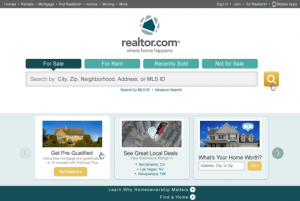
 We have seen some re-branding released recently from leading real estate consumer brands. Today we see the release of the new Realtor.com – where home happens. Last year saw the rebirth of Century 21 – Stronger, Bolder, Faster.
These are very well recognized consumer brands. MOVE EVP Marketing, Barbara O’Connor and her team took a close look at the Realtor.com brand within a year of her arrival at the company. I am excited to see how this new treatment works out. I can assure you that they have likely exhausted focus groups to predictably make a selection that reaches their target with both consumers and the industry. Presumably they had the additional challenge of NAR review, since the REALTOR brand comes through the license agreement. It is an interesting challenge to blend someone another company brand into your brand. I think that O’Connor and team did a great job. I like it.
Beverly Thorne and her team at Century 21 led the charge for their initiative following a similar pattern. It is common for a new marketing leader to take a good look at the brand in their first year in office. As the custodian of a brand, great marketers establish a clear and measured understanding of what they have inherited. Both Century 21 and realtor.com appeal to consumers and agents alike. It makes branding hard. At once you are appealing to a 35 year old consumer and a 54 year old REALTOR ®
Here’s a few thoughts from Andrew Strickman, VP Brand & Creative at move, Inc.
“As we heighten our focus on developing a rich consumer experience and creating an emotional attachment to our audience, we recognized that it was time to update our realtor.com branding, positioning and tagline. We conducted extensive research and spoke with consumers from across the country as key input to the development of our revised logo and new site look and feel. We heard from them that a valued online real estate brand is one that embraces the notion of home — whether that home is their first rental out of college, or the 3-bedroom house that marks the beginning of a new family growing out of their starter home.
Most online real estate brands feel clinical, data- and machine-driven and do not have a human feel, even though they are all about creating connections with real human beings. Our role with this rebranding effort — and graphic iconography that represents home in the center of a community (‘all roads lead home’) is to draw a much stronger connection between realtor.com and the people that fuel its service — both consumers and REALTORS.”
To appreciate the effort, begin by taking a look at the move, inc brand. Notice how the circle with the house was carried from move over to realtor.com. They also decided to stick with the lower case text convention. I am not a font master, but I suspect that the font is pretty similar if not the same. The tag line of “where home happens” was also added. I dig it. It is not as blatantly aspirational as Smarter, Bolder, Faster of Century 21 – but I suspect that they were on a different mission. It is interesting that they departed from using the R from the National Association of REALTORS®.
The official press release of the realtor.com brand from move should be coming out in the next few weeks.


[…] are all about creating connections with real human beings,” Strickman said in a statement posted by the consulting firm WAV […]
[…] are all about creating connections with real human beings,” Strickman said in a statement posted by the consulting firm WAV […]