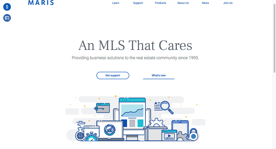
 When I sat down with Tim Dain and Quinn Nichols at CMLS to get a sneak peek at the new MARIS website they were getting close to finishing, they were pretty giddy about their site. They had been working on this for months, so I completely understood their euphoria. Anyone who has given ‘birth’ to a new website knows the pain you endure until it makes its public debut.
What was particularly daunting about this assignment was the scope of the audience they were aiming to please: 13,000 members in more than a dozen Associations located in 53 counties in two states: Missouri and Illinois.
As Dain started to scroll through the pages for me, his excitement began to build. At one point, I thought he was about to levitate out of his seat since he was so enthusiastic. Nichols eagerly was watching me closely, gauging my reactions. She was exhausted by the effort, as this site was driven by content and Nichols is the St. Louis-based association’s “Queen of Content.”
For an MLS website, they have raised the bar. That bar is set about ten stories higher than where most MLSs are today. Most MLSs will need to take an elevator to get close to where MARIS is today with their new website.
Massive Content
First and foremost, this site’s principal focus is rich content that’s member-centric. It’s packed with information that its members can access 24/7. The highlight is “Watch & Learn,” an on-demand video training library that surprisingly is not trapped behind a paywall and requires no password so that anyone can access these videos at any time. This kind of openness and immediacy is simply brilliant. There are dozens of videos covering everything, from how to use the MARIS mobile app to entering and editing a listing on Matrix.
Apple-esque Design
What I love most about the new MARIS website is the amount of white space that’s used. MARIS credits the site’s design to 1000watt, which is well-known for creating beautiful sites that work exceptionally well. The MARIS website is no exception. It’s easy to navigate, is exceptionally mobile-friendly, and is easy on the eyes: uncluttered and simple, it allows the user to focus and quickly get right to the task at hand.
Authentic Feel
There’s also something so Midwest about this site. For example, this is how they describe themselves on their “About Us” page:
“We are an MLS that takes a blue jeans and white glove approach to serving our members and the real estate community.”
And their home page welcoming headline proclaims their “Why” – why they do what they do, declaring: “An MLS That Cares.”
Finally, there’s another video section, accessible from the bottom of their Home Page called, “MARIS Asks.” It features a series of video interviews with industry experts and leaders who answer this question: “Why MLS?”
It’s a fantastically creative and well executed section. Interview subjects already include Brad Inman, Inman New; Glenn Kelman, Redfin; Craig Cheatham, The Realty Alliance; and many industry consultants including Saul Klein, Rob Hahn, Brian Boero, and our own WAV Group Founding Partner Marilyn Wilson, along with many others. Warning: like a Lays Potato chip, you can’t just eat one; if you click and watch one, you’ll find yourself watching another, and another, and another…so set aside some time for a sweet little binge on “Why MLS.” Believe it or not, there’s some wickedly powerful stuff here.
Check It Out
The fact is that when you have anything that involves design, beauty is in the eye of the beholder. MARIS has launched a visually compelling and efficient site that works on so many levels, but where it shines like a supernova is in its content. Knowing Dain and Nichols, I am pretty confident they are just getting started, and this site will get better and better.
If you run an MLS with an outdated site and have a problem with members engagement, go to marismls.com and study what they’ve done. Then get ready to jump on an elevator as you are going to have to climb a lot of floors to catch up if they keep improving this site.
The best thing that MARIS has done? They sent a wakeup call to all MLSs with old websites that it’s time to ditch their dinosaur sites and rethink how to engage and better serve their members online. MARIS did it. Now it’s your turn.


[…] registrations and video plays, validating the “content-first” strategy. Both Vendor Alley and WAV Group also weighed in with […]